Currency exchange made easy
Introduction
This is a product that empowers budget travelers to take advantage of currency weakness and purchase currency at a published rate to lock in the discount. It also provides a convenient way for them to access their funds at a foreign location. Lastly, they are able to keep their foreign currency balances at a safe place, e.g. a bank.
Current challenges
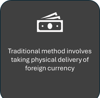

ROLE
Designer
TIME FRAME
4 weeks
SKILLS
UI/UX
Research
Prototyping
Figma
Solution
The goal is to create a user-friendly product to let users buy currencies easily, safekeeping at a trusted banking institution and readily accessible when needed.
The product has the following features and functionalities:
users can transact foreign currencies within their existing bank accounts
a dedicated foreign currency account but connected to user’s existing bank account
friendly UX that makes monitoring, tracking and transacting seamless and easy
while overseas, user accesses foreign currency account using his existing bank card
The process
We employed a thoughtful, rigorous and disciplined approach to ensure the end-product resonates with targeted users.
Our eight-step process:
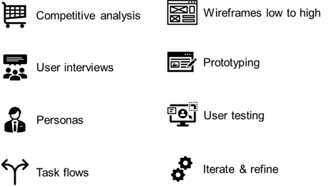

Step 1: competitive analysis
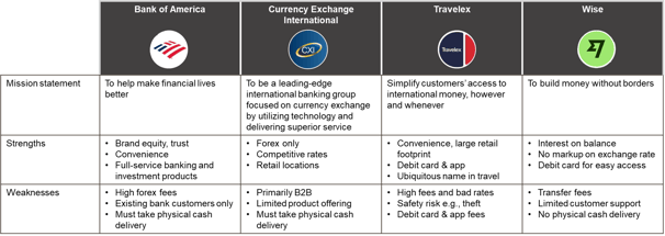
Four foreign exchange (forex) options were carefully reviewed:
Step 2: user interviews
How we selected the five interviewees:
People who keep track of currency fluctuations, specifically for travels
People who are budget conscious and see currency arbitrage as another way to save on travel costs
People who do not want to hold physical currencies or travel with a large amount of cash
People who withdraw money from an ATM in a foreign country
Interview findings:
We interviewed men and women 18 years or older to get their international travel habits and preferences, specifically how they access foreign currencies and how they action on currency fluctuations. Currency hedging or arbitrage is a common strategy used in businesses but not in retail.
We discovered travelers’ cash usage is small (<20% of overall expenditure) but are nonetheless interested in capitalizing on currency weaknesses if there is:
an easy way to do it
a convenient way to store and access
competitively priced
Step 3: personas
Persona #1 - Jennifer, 48 y.o.
cost-conscious mother of two


Persona #2 - John, 54, y.o.
unique experience seeker
Occupation: financial services
Location: New York City, New York
Traits: cost sensitive traveler, prioritizes safety, family-oriented
Needs: easy way to hedge currency fluctuation, easy access to funds and account safety
Challenges: foreign currency hedge is complex and difficult to navigate, physical cash carries risk of theft or loss
Occupation: physician
Location: San Francisco, California
Traits: seasoned traveler, value-oriented, prioritizes experiences
Needs: user-friendly foreign exchange tool, connectivity with existing bank accounts, easy access to funds overseas
Challenges: physical cash delivery is risky due to theft or loss; foreign exchange options are expensive or “rife with scams"
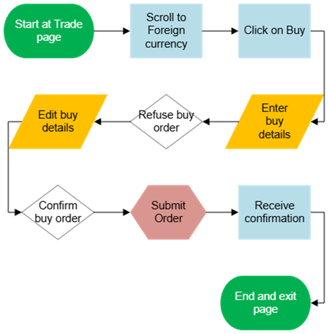
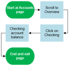
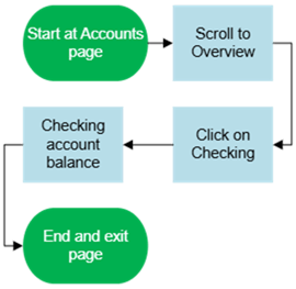
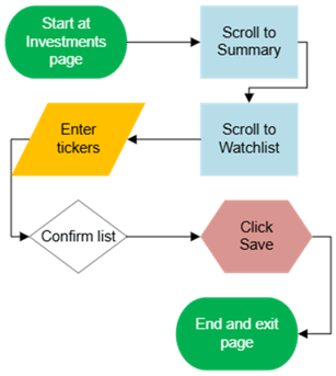
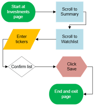
Step 4: task flows
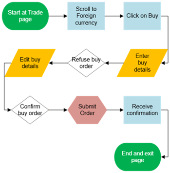
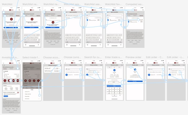
Three task flows were used to gauge usability and viability with testers
Edit an order
Look up account balance
Build a watchlist
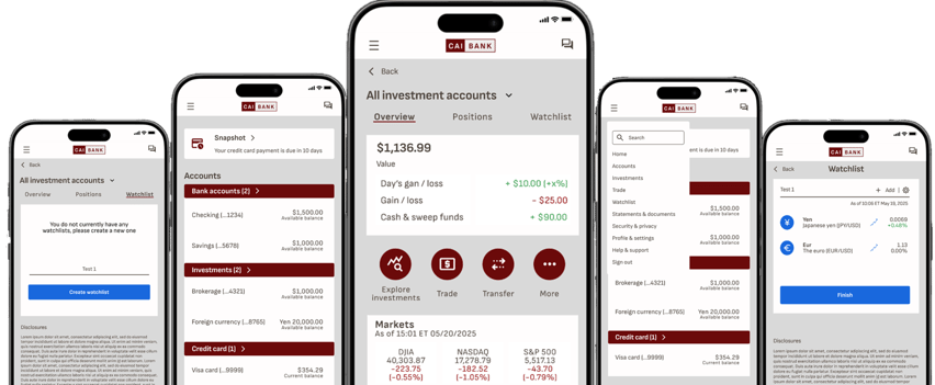
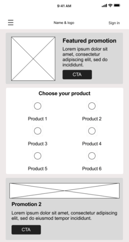
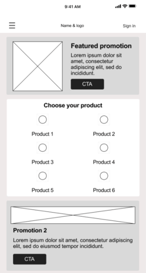
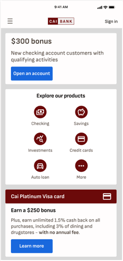
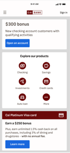
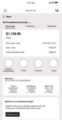
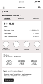
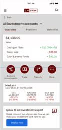
Step 5: wireframes
Low fidelity
High fidelity

Step 6: prototyping
A prototype was developed to facilitate user testing, with three pre-determined tasks (see step #4) for users to test
Step 7: user testing
We recruited testers to accomplish three tasks by using the prototype.
Participants – five users, one in person and four via virtual meeting (Zoom)
Tasks tested – 1) look up balances, 2) initiate a foreign currency trade, and 3) build a watchlist
Success metrics – successful completion of tasks and achieve a three or higher rating
Results – all testers completed the three tasks without difficulties with the following average rating scores: overall 3.8/5, look up balances 4.0/5, submit and edit a trade 3.8/5, and finally build a watchlist 3.6/5
Step 8: iterate & finetune
We analyzed observations from usability testing, and recommended the below changes:
make existing watchlist a selection in the watchlist page
optimize watchlist creation to address the "too many screens to click through" comment
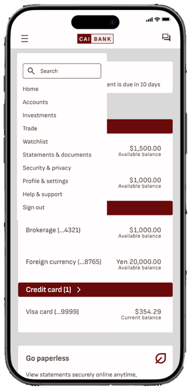
build out hamburger menu to make quicker access to various tasks

