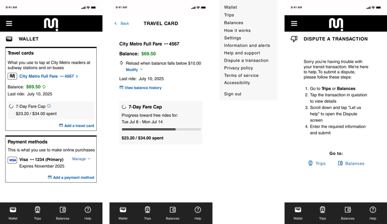
An end-to-end mobile app delivers comprehensive transit transaction details to riders.
Category:
End-to-end


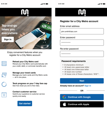
This case study showcases the creation of a transit application that supports a tap-and-go payment system. The goal is to help riders keep track of their spendings, manage their payment methods and an easy way to dispute charges as needed.
Overview
Role: UX/UI designer
Tool: Figma
Context: Conceptual project
Duration: 80 hours
Project summary
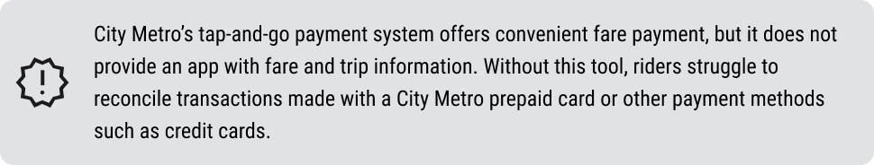
Problem
Background
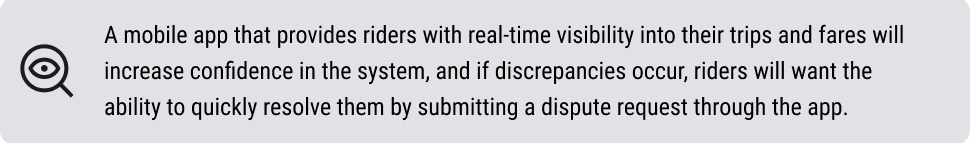
Hypothesis
Competitive analysis
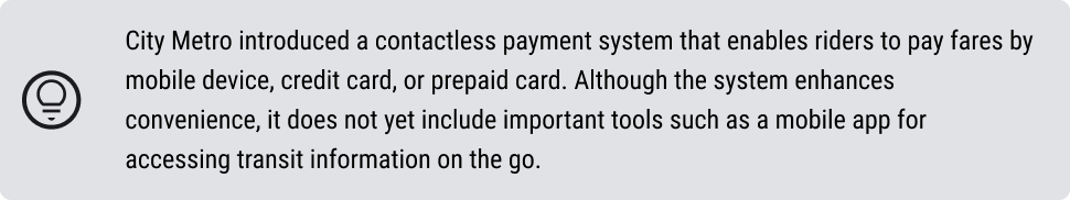
A SWOT (Strengths, Weaknesses, Opportunities, Threats) analysis was conducted on transit contactless payment methods, including prepaid transit cards and major credit cards. The evaluation aimed to identify best practices, uncover mobile app feature gaps, highlight industry trends, and generate actionable insights.


User interviews
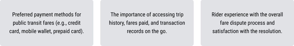
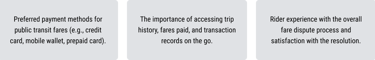
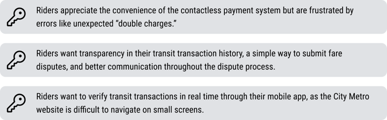
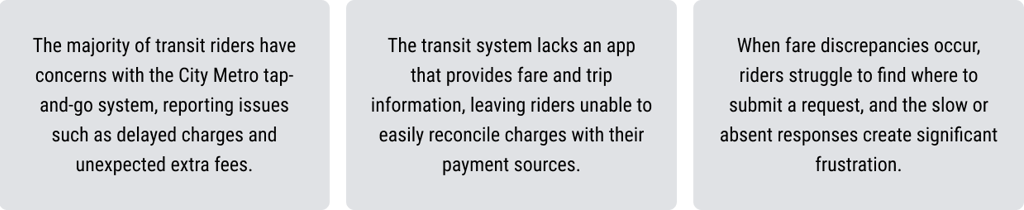
Interviews were conducted to validate the hypothesis and uncover new opportunities and ideas. Participants were regular transit riders using contactless payment methods. Sessions were held both in person and virtually, focusing on three key areas:
Findings
Research

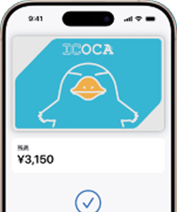
ICOCA prepaid transit card (Japan)
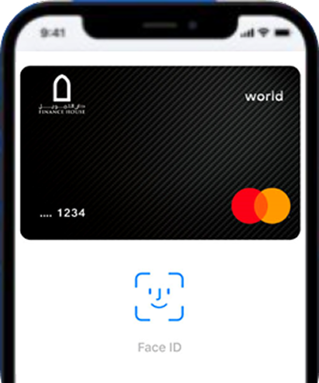
Credit card in iPhone Wallet
City Metro prepaid transit card
Major credit cards contactless payment
Discoveries
Problem statements

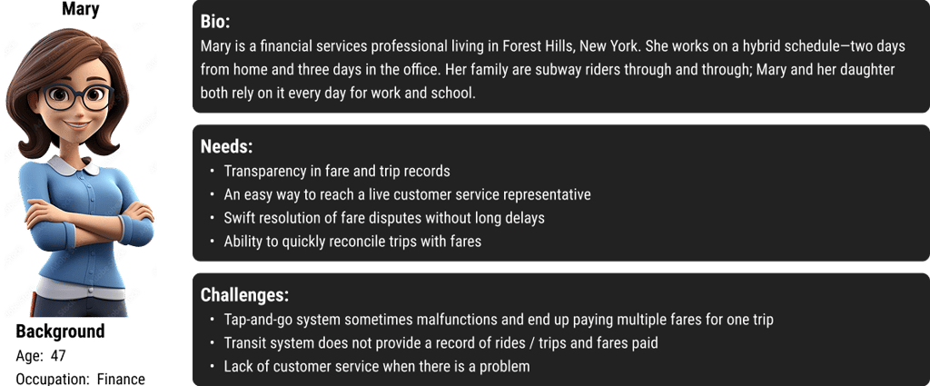
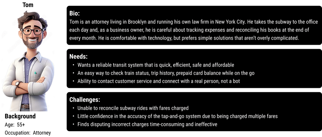
User personas
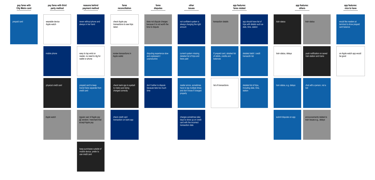
Affinity mapping
Synthesizing research is a crucial step in the design process that transforms raw data into actionable insights. It involves organizing, interpreting, and deriving meaning from user study data to uncover patterns and inform design decisions. This section highlights how research findings were translated into meaningful insights.
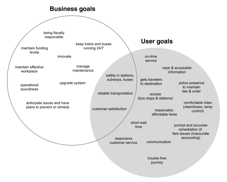
User and business goals

Feature prioritization
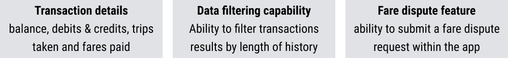
Must have features:
Information architecture
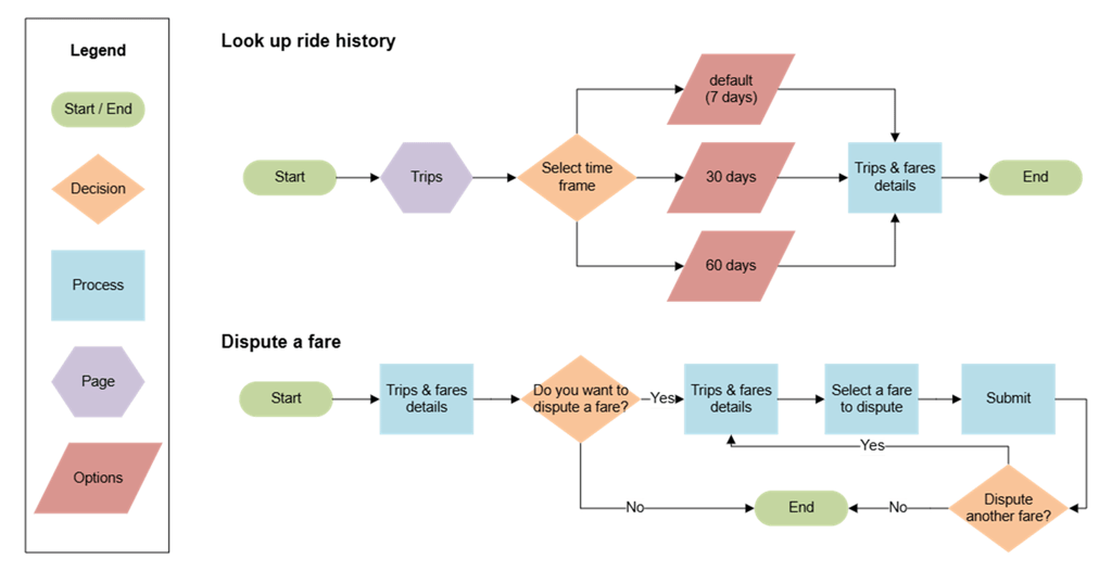

User flows
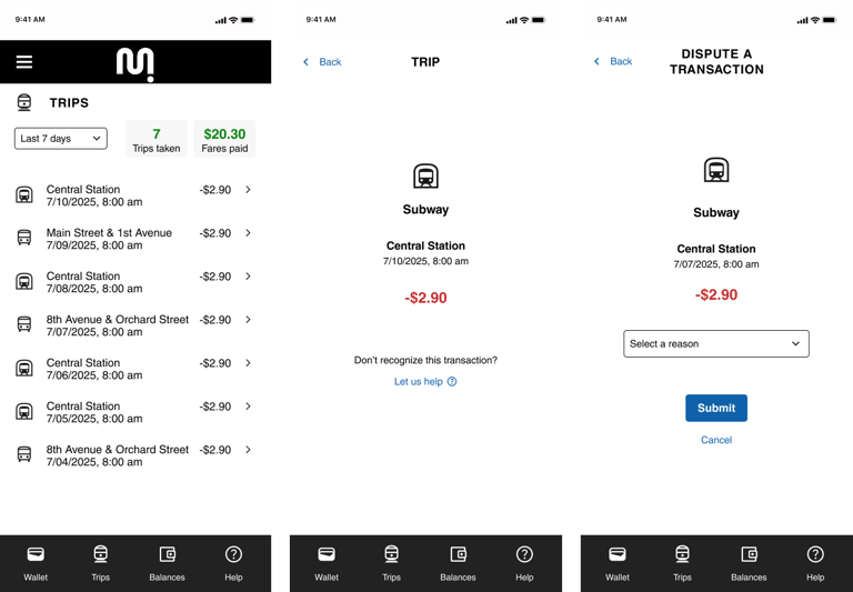
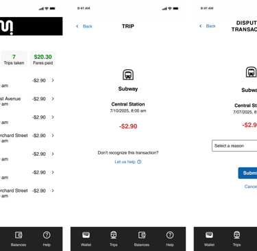
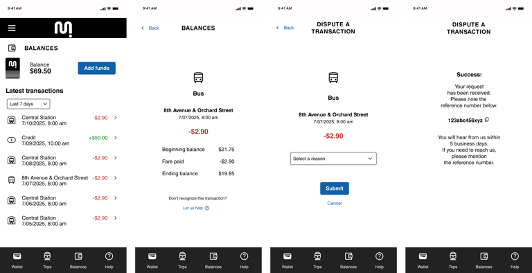
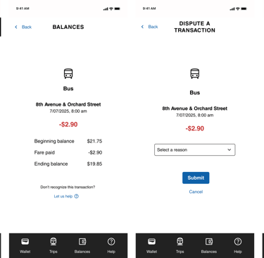
Multiple user flows were tested and refined to deliver a seamless journey that addresses potential challenges. The goal is for users to use the app to look up history and dispute a fare without experiencing major roadblocks.
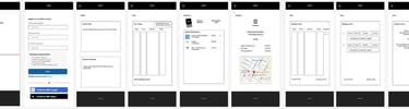
Sketches
Low-fidelity wireframes keep the design process focused on structure and flow. These simple layouts allow for testing ideas, uncovering issues without getting caught up in details, and building alignment on big-picture requirements.
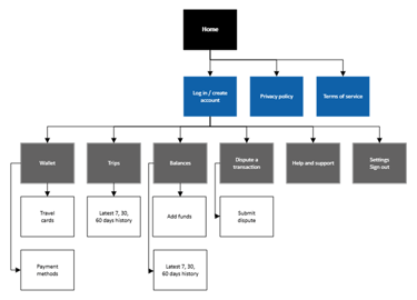
Site map

A process focused on continuous improvement through iterative cycles of prototyping, testing, and refining based on user feedback. Input was collected on both low-fidelity sketches and high-fidelity wireframes to ensure each iteration reflected user needs and insights.
Design & iterations
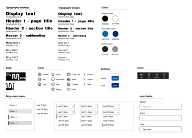
UI kit
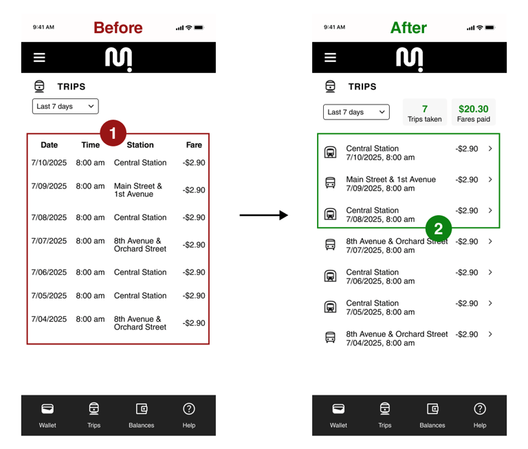
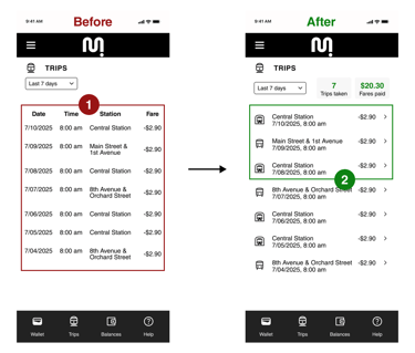
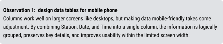
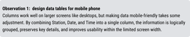
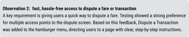
Observations
Testing revealed issues and opportunities for improvement. After multiple iterations, the final designs are more user-friendly and intuitive.
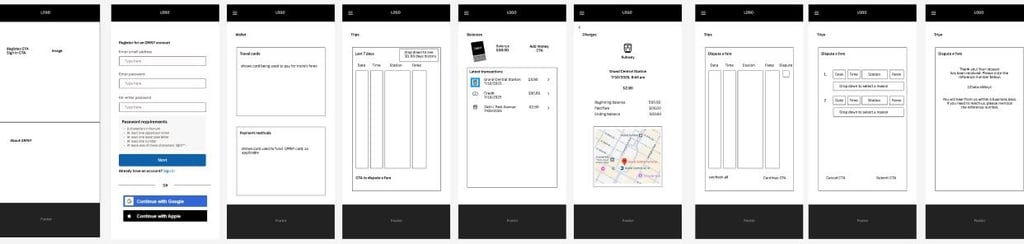
High fidelity wireframes
Usability testing
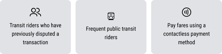
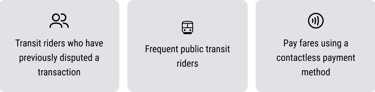
Recruiting the right participants is essential for effective usability testing. To ensure meaningful insights that guide actionable design improvements and accurately reflect the target audience, participants were selected based on the following criteria:
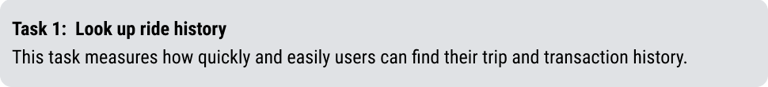
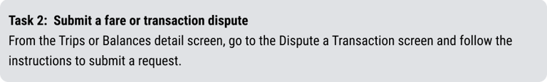
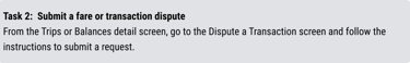
This usability test was designed to evaluate how easily and efficiently users can navigate key features of the transit app. The primary objectives were to assess clarity, usability, and overall user experience when completing two core tasks. Insights from this test help identify pain points and guide improvements for a smoother, more intuitive experience. The test focused on two critical tasks:
Usability testing was conducted both in-person and via Zoom.

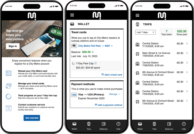
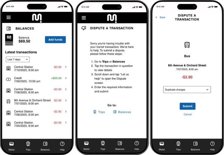
Final design
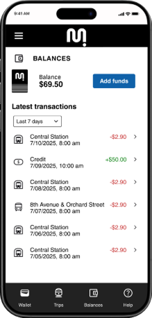
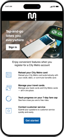
These screens show the key functionalities of the app and user flows of looking up transactions and submitting a dispute.